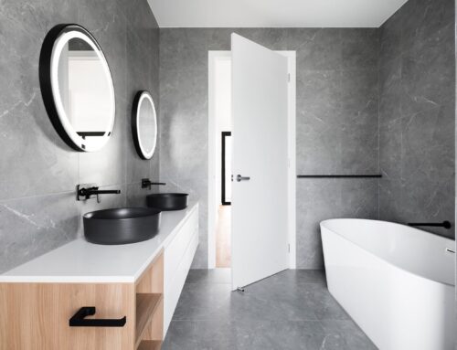
Good news people, colour in the kitchen is back in big style and it’s here to stay!
I have to admit, I’ve been scared of using colour in my kitchens to this point. My practical, real estate brain restricts me somewhat as I know that come time to sell, colour can be polarising and could affect the resale of my home.
In selling a home there are two ways to seal the deal… either win the heart of a buyer so that they are so emotionally invested they can’t bear to miss out, or remove the doubt of a buyer. Eliminate anything that will polarise them. I’ve been reluctant to add colour for fear of planting doubt in a buyer around the cost of making a change to one of the most high-value areas of the home if it’s not to their taste.
The good news is that people are experimenting more with colour at the same rate as buyers seeking it.
So now is the time to embrace it people! But where to start when it comes to being bold with colour in the kitchen? I need that advice as much as you do, so I’ve asked Rachel Rimmer, a fellow Yarravillian and owner of Hello Colour for her advice.
Here are some colourful words from Rachel…
When it comes to kitchens, people are understandably nervous about making a mistake with their colour choice, often aiming for a “timeless” end result. Also known as white!
White definitely has a place in kitchens, it adds a feeling of lightness and space like no other. But trust us, there’s a rainbow of other options out there just waiting to make your space look amazing, and make your space feel like … well .. you.
There are many super reasons to include colour in your space. It can make a space feel bigger and brighter or cosy and more intimate. Colour also creates “mood” in your space. Want to rest and relax? There’s a colour for that. Want your space to revitalise you? There’s a colour for that too. Working out what you want from your space, is an excellent starting point for your kitchen colour selections.
When we’re looking at colours for your kitchen, we’re not just talking about cabinets. There are so many potential colour opportunities: splashbacks, benchtops, flooring, appliances (hello Smeg dream fridge!), sinks, tapware, lighting, artwork and of course, furniture. And the brilliant part, is you can pick and choose as much or as little colour as you like. We love to use mood boards to collate, visualise and fine-tune potential colour schemes, you might too.
Whichever mix of colours, textures and finishes you choose, the most important thing is they resonate with you and type of space you’d like to live in. Doesn’t it make sense to create a space which feels amazing for you, right now? Don’t design for the people who may or may not browse your open for inspection in 10 years’ time. Because in 10 years’ time, who know what the trend du jour will be?
We thought we’d share a few fave kitchen colour ideas to consider for your next project. Hint, hint.
Current crush: dark, dramatic kitchens.
So you’ve seen black and kind of like charcoal but were wondering if there might be something else? There is! Look no further than a delicious inky blue. The best thing about these dark, dramatic colours? With a big V for versatile, they work with variety of kitchen styles, from industrial, to classic or even modern. And serve as a super background for wow details, like that marble bench you’ve been eyeing off or an incredible brass handle. We just love the ocean blue tile and cabinetry combo in this Doherty Designs project, heaven!
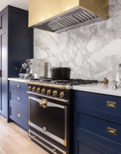
Design: Grant K. Gibson Interior Design
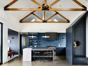
Design: Doherty Design Studio. Photographer: Derek Swalwell
Would you believe we’ve had a least 3 conversations about teal kitchens in the last few months? True! You’ll definitely be seeing jewel tones trending on Pinterest. Striking as a choice for cabinetry or stunning as a tiled splashback, we think teal is a winner. Keen to add a touch of timber? Teal works well with rich walnut tones.
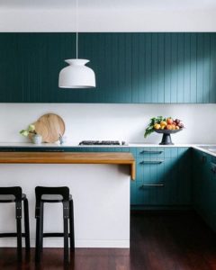
Design: Arent & Pyke. Photographer: Felix Forest
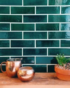
Mercury Mosaics
You might have seen beautiful smokey greens been popping up in interiors lately. The reason for their popularity? They have a subtle softness, which make them oh, so easy to live with. Bringing the outside in, these understated greens contain a hint of grey, meaning they sit comfortably with other grey finishes in your space (tick!).
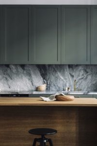
Asplund.org
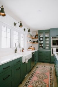
Jaclyn Peters Design
A baby blue kitchen? Yes way! Perfectly pink cabinets? Cute! Need some convincing? Look no further than this aquamarine kitchen, by local architects Alter Eco, or this blush beauty by the folks at Cantilever. Both kitchens demonstrate how pastels can be used simply and cleverly to add a serious pop of personality.
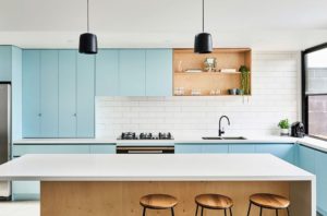
Design: Alter Eco Design. Photographer: Nikole Ramsay
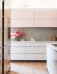
Design: Cantilever Interiors for Design Files Open House. Photographer: Eve Wilson for The Design
Our biz wouldn’t be called Hello Colour, if we didn’t include some of our fave colourful kitchens. Brace for brights friends! Alex Fulton, interior designer and self-confessed colour nut, designed this incredible colourful kitchen. With plentiful colour pops and oodles of black and white, it would be impossible to start the day in anything other than a fabulous mood, don’t you think?!
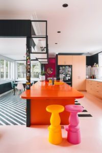
Design: Alex Fulton Photographer: Duncan Innes for Homestyle NZ
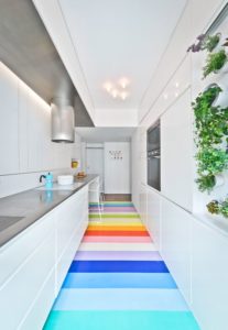
Design: SABO Project Photographer: Alex Delaunay
We so hope you’re inspired to add a splash of colour (or three) to your next kitchen project. If you do, we’d love to see it too! Tag #hellocolour and #westhome so we can see!
Need more inspo? Check our Colourful Kitchens board on Pinterest.
Contact deets:
Hello Colour
https://www.hellocolour.com.au
Instagram: @sayhellocolour


