Creating the dream home to stay in the tightly held suburb of Kingsville was the goal for Mardi and Matt and their two little men.
“We wanted a practical but unexpectedly designed home that hit all the requirements for quick and easy family living. Our brief was to have everything! As long as it wasn’t a big box, full of downlights, tacked on the back of the home. And what we have achieved on our small parcel of land is remarkable,” said Mardi when I hit her up to squeeze all of the reno juice.
So bringing onboard Sabino Choi, owner of YSC Architects to nail the brief for the regally named ‘Empress House’ was the first order of business for the fam.
Sabino’s architectural response was inspired by the concept of a jewellery box and creating a home to store the most prized possession like a jewellery box. The goal was to create a safe haven for a family’s most precious possessions.
For Mardi and Matt, a feeling of great happiness and contentment as they open the bright blue lid (aka the head turning front door) of the jewellery box reflects the success in the project in meeting the family’s brief from the outset.
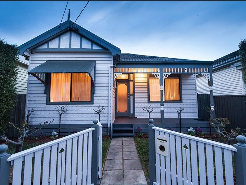
Empress House before
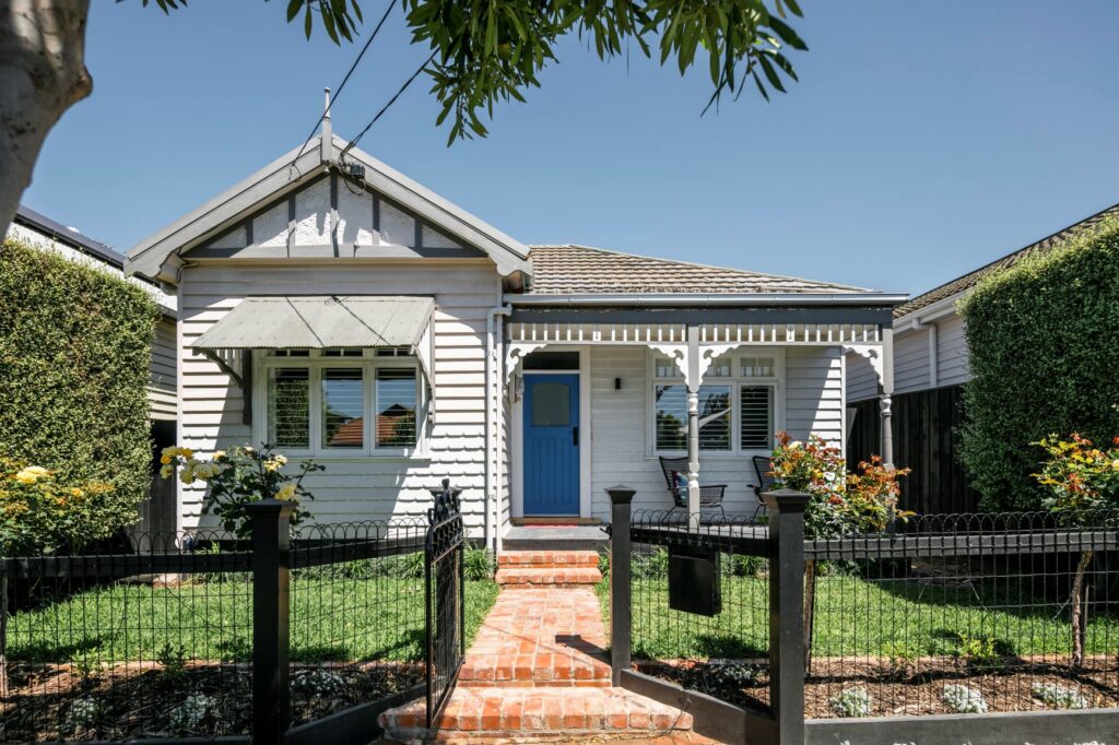
Empress House after
Careful consideration was given to all aspects of the home from the front door through to the clever integration of appliances and design of the main living space to ensure the perfect balance between practicality, functionality and “unexpected”.
As you move through the home and begin to unveil the layers of the jewellery box, the first discovery are the beautiful jewels respectfully restored to honour the heritage of the home. Ceiling roses and picture rails maintained and modernised with contemporary lighting and artwork – a strong feature throughout the home.
As you head down the oak timber floors, you further open up the jewellery box to the sunlight and it shines bright like a diamond. Just like Rhianna said it would. The end of the hallway demarcates a transition zone with a lowered ceiling and an expression through a change in floor material – going from timber flooring to a modern burnished concrete floor.
“It was important to respect the existing character of the neighbourhood as well as the heritage overlay and appearance the house offered and introducing a buffer zone to graciously and harmoniously transit from old to new enabled us to achieve this,” said Sabino.
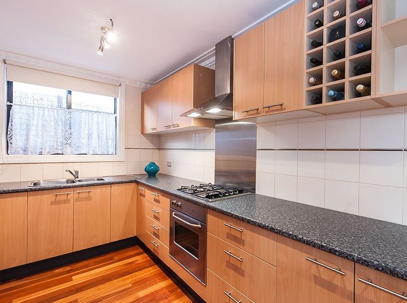
Kitchen before
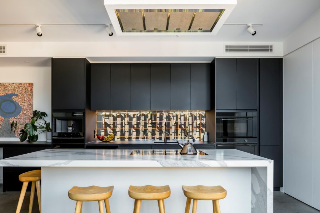
Kitchen after
This multi-zoned L-shaped living space that envelopes the rear of the home has been designed with thoughtful consideration to orientation to bring vast northern sunlight into the contemporary kitchen, dining and living area.
“In working within the confines of a modest block, we needed to think creatively and apply unconventional design ideas that play with shape and volume such as ceilings that slope and twists to create a feeling of greater space,” said Sabino.
“It was imperative for us to maximise natural light and optimise the feeling of indoor – outdoor connection from the main living area while also creating two distinct living zones without closing in the space,” said Mardi.
“Integration and considered design have enabled us to achieve this – from the retractable doors and flyscreen that disappear into the cavity, to the kids’ space with hanging doors that enable the family to be connected while also becoming its own private kids retreat that the boys want to get a sign for that says No Adults Allowed!”
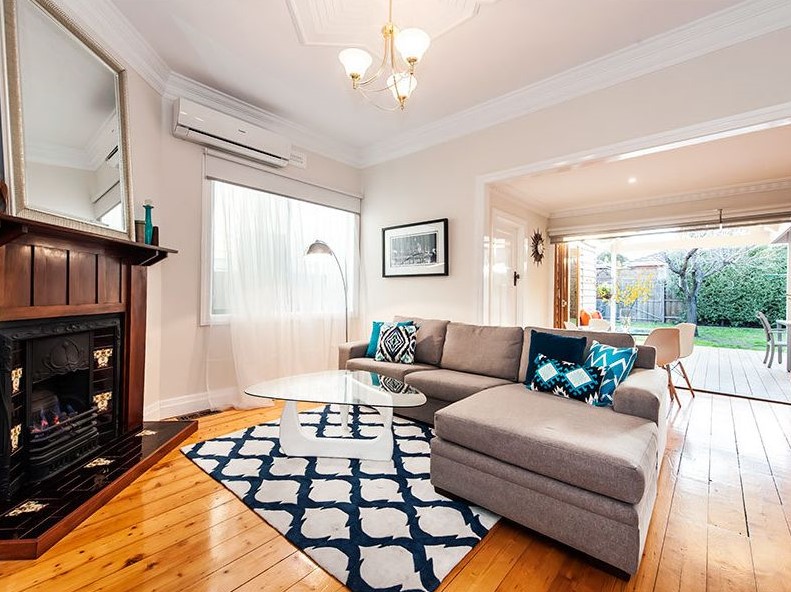
Living before
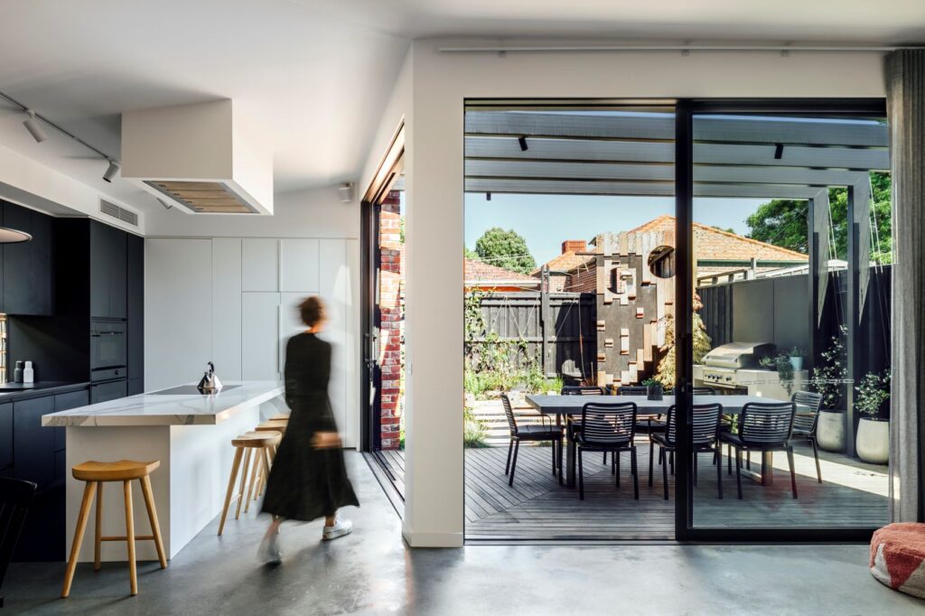
Open plan living after
Comfort and practicality were at the heart of the design to maximise all available space and adding features that improve the liveability of the home.
“We don’t share the concern of many around the comfort and liveability of a weatherboard home. We installed double glazed with E glass unit windows and skylights to capture and maximise the right type of light and heat throughout the home, particularly on the south facing aspect,” said Mardi.
“The concrete flooring combined with in-floor heating has made a big difference in the way we live and use the space. We wanted to bring in as much light to the living space but we didn’t want to take on any of its heat.”
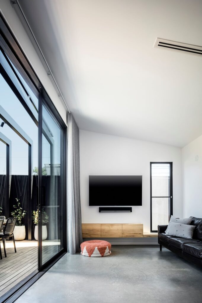
Second living area
Inside there is no end to the maximisation of space. A custom day bed in the kid’s area was designed with deep storage in mind to hide away all the toys and games even though Mardi is certain that one day the kids will get on board with styling and create a beautiful display of perfectly assembled Lego across the top of the day bed (is she dreaming?!).
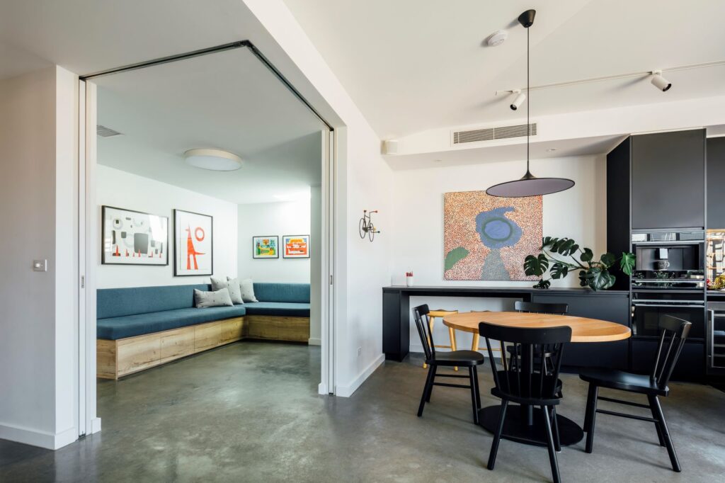
Kids zone goals
In the kitchen area, it is almost a game of hide and seek to find the integrated Fisher & Paykel solutions hidden behind the bold black cabinetry. Even a plate warmer below the coffee maker. For reals. And a butler’s pantry, another hidden gem found beyond the panelled white wall of cabinetry.
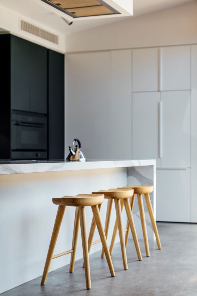
Hidden cabinetry goals
Outside, the garden space was designed to be warm, inviting, low maintenance and “not too manicured”. As the Star Jasmine climbs up the steel metal frame over the outdoor dining area and behind the glazed splashback in the kitchen the feeling of bring the outdoor in will further enhance over time.
Materials were carefully selected from fibre-cement cladding painted in matt black and paying homage to the former home such as through re-use of red bricks – the homes old chimney.
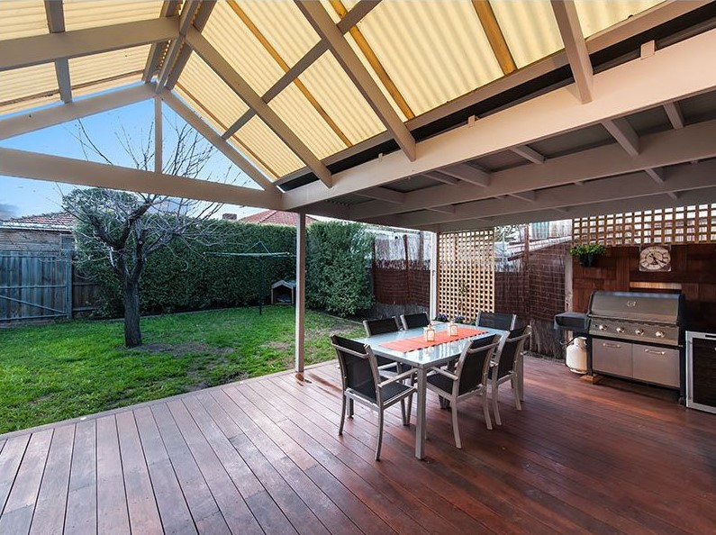
Outdoor before
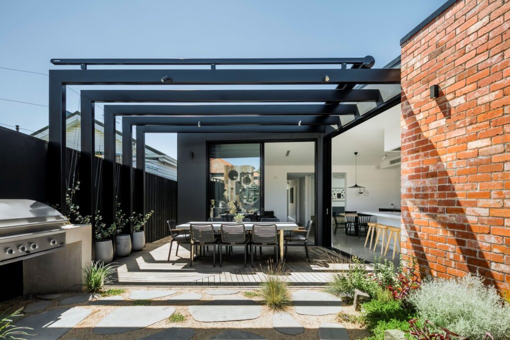
Outdoor after
Every aspect of the family’s everyday life was addressed through this project, such as the inclusion of bike storage for this brood of avid cyclists and a clothesline that gets a fair amount of usage, tucked away behind the home out of sight.
And to ensure that others were able to enjoy the contents of said architectural precious jewellery box, access to the rear lane way was prioritised to welcome neighbours into the home. Next level community type business.
This is such a spectacular home and bang on the brief of “unexpected.” Well done to Mardi and Matt for their vision and picking Sabino to build on and execute your vision with utter perfection. Nailed it.
Stunning “after” images were also absolutely nailed by Michael Kai.


